Sunday, July 18, 2010

sketch


I've been doing a lot of sketches lately with somewhat the same feel to the Matei Apostolescu master study I did in Mr. Babcock's class earlier this summer. Not sure where I'm heading with them but would like to elaborate at some point. Here is just an example of one:


Quite sloppy, I know, but I try to do them in under 20 minutes.


Friday, June 18, 2010

Reflections


First, thanks to Mr. Babcock for being so prompt in answering our questions and for being so thorough in your comments and videos. Not only have I learned a lot by you helping me and answering my questions personally, but the videos you made for other people helped just as much and taught me a lot of things about the programs I would have never known how to go about otherwise.
Also, thaks to the rest of you who left comments and suggestions throughout the course; your insights were very helpful and much appreciated. I really think the fact that this class is in a blog setting helps tremendously because we were all able to help and critique each other at 'the speed of Internet', 24/7, versus being limited to just a few days a week for a few hours a day in a classroom, given that we'd all even show up every day.

I really learned a lot in the last six weeks. I think the style in which we did the projects (master study then original, repeat) was a great way to go. You know, I could read the instructions on how to do something a hundred times but I wouldn't gain as much as I would by learning hands-on, through trial and error, how an artist executed something. Even when I didn't figure something out the first time through, the process was helpful because I'd learn other things, sometimes by accident.

I learned about a lot new tools as well as mastering a few that I had prior knowledge of including but not limited to the blob brush, pen tool, gradient mesh, clipping masks, layer masks, the advantages and disadvantages of making selections via quick masks vs. magic wand vs. marquees vs. lassos, all the different layer modes, several different filters, making new brushes (both regular and pattern) in Illustrator, etc. I learned that the eraser tool can be detrimental and that there is almost always more than one way to do something. Also, I got a lot of much needed practice with my Wacom, which at the start of the course I was very new to, and now I don't ever want to be without it.

As for my overall comfortability, before taking this course I would honestly almost cringe when I had to do something that involved Illustrator instead of Photoshop. But since I forced myself to do a few projects solely in vector
, I got a lot of much needed practice and am proud to say I'm starting to really come around. And by come around, I mean I kind of love working with vectors now. Also, I've realized in the process of this course, just how important it is to be organized. I used to waste so much time by having my layers in no particular order and when I wanted to edit something, I'd have to run down through the list until I found it. Grouping and naming works wonders, who knew? Now I just need to figure out how to organize my apartment.

In the future, my goal is to continue doing master studies as I think it legitimately helps and I don't think there's such a thing as too much practice. I want to continue improving with vectors and I'd like to keep learning new tools and shortcuts in Photoshop. I'm looking forward to mastering the tablet as well. The goal is to get what's in my mind onto the screen. :)


Thanks again to everyone for your help and kind words, and good luck to all of you in the future.


Thursday, June 17, 2010

Final!

My brother just enlisted into the Army so this one is for him. Not the most pleasant piece ever, but realistic.


Here it is:


And the tutorial on how I did it:


I've been awake for like two days, so I think I'll wait and do my reflection after I get some sleep. Otherwise, it won't make sense.

Original #4 & Proposal


This is my original based on the Rhys Owens piece I copied. Done in Photoshop and Illustrator.
Angry shark is angry:


Below are the three main pictures I used in collaboration.


I selected each of them and then free transformed, warped, rotated, and masked them to get the best fit I could.


Next, I desaturated everything except the shark's mouth. I selected the tie, added a layer of flat, red color on top then Overlayed it. I applied the 8-layer cutout filter to everything and then faded them to 80%. I made the background in Illustrator using the gradient mesh tool and then brought it over. I added a grainy effect on the jacket by adding gray areas with my brush tool and then applying a gaussian blur, film grain filter, and then played around with the levels until I thought it looked right.


Last, I added the dark, gray border and logo complete with drop shadow and bullet wound. I got the logo from the internet and drew my version of a bullet hole with the brush tool (looked at pictures on the Internet for reference). Also added a background texture with my brush tool, lowered the opacity to 15% and applied a color dodge but it might not be shown in this screenshot.


I had a lot of fun with this study and original. I've always enjoyed merging different elements from different photos together but doing so eloquently to create an actual character can sometimes be a challenge. I also did a lot of trial and error with grain/blur filters and layer modes which helped me really get a feel for what effect will come of doing something without actually having to test it out and see.


Proposal:
I've decided to do the tutorial. I think the easiest way to master something is by teaching it to someone else. It forces you to really think about what you're doing and saying, and then having to actually explain the motives behind something can really give you a better understanding of the process instead of just going through the motions. I've never done a tutorial before so please don't expect flawlessness, but I'm going to do my best to explain what exactly I'm doing and why.

Saturday, June 12, 2010

Rhys Owens Master Study


I decided to do my last study based on a piece by Welsh Illustrator, Rhys Owens. It seems like he has a lot of pieces that incorporate both Illustrator
and Photoshop, and I just like his overall style.

Since his piece uses specific photos that I didn't have access to, I just had to do the best with what I could find.


Here's his original:


Here's mine:


First, here are the images that I used. Found them in a google search:


Kind of a long step.
I extracted the hoodie, the cat's head, and the headphones from their originals, placed them together, then desaturated everything. I did 8-layer cutout filters to all of them but faded the headphones to 80%. I used the brush tool to change the back of the jacket and cat's head to black. I drew the glasses in Illustrator and brought them over. Then I selected the section on the headphones that I wanted to color red, filled it with flat color using the paint bucket, then changed the mode to Overlay. Last, I drew the cord with the brush tool.


I opened a flattened .jpg of my work so far in a separate window, selected the area I wanted, and filled with the paint bucket. I then copied it over to my .psd, enlarged it, and placed it behind the cat.


Next, I just added and fixed certain details: added a layer of flat, yellow to the top of the cat and changed it to Soft Light mode, drew the whiskers and additional fur onto the face, dissolved some of the black on the jacket, added the border, touched up the glasses and surrounding, yellow line, etc.


Last, I drew the coffee logo in Illustrator and transferred it over.


Pretty pleased with the way it turned out. I guess I didn't realize this when I was doing it, but there seems to be a little bit of texture on top of the orange background/logo in his piece, so I might go back and add that.


Original #3


Okay, I'm back.

Here is the original I did based on my Matei Apostolescu master study. I decided to go a little bit different route than the study. Instead of leaving most of the picture white, I have covered this entire piece in light color and I decided that I'd make the content a little bit more realistic (but still maintained some of the crazy, line work that Apostolescu incorporates into his pieces; I just aimed to make it a little bit more controlled. See: mountains, rocks).


I forgot to take in-progress screenshots until I was about 98% finished, but my process wasn't much different from the original. I did a sketch in ink, scanned it in, went over it with the tablet, made the colorful lines in Illustrator and brought them over, then lots of mask work to finish up. I decided that I wanted the illusion of shadows on the mountains to be made up of line work that somewhat mimics Arabic writing (might have even slipped a phrase or two in there!). Maybe a bit cheesy but ehh.
I do like that it's a bit ironic in that the colors are warm and light and happy, but the content is sad and harsh.

Might go back and make the kid's clothes a different color. Might also make the AK-47 a different color than the kid.


Mr. Babcock, if you read this, I know it has nothing to do with this particular project but:
Sometimes if I exit out of Photoshop and come back, my brush tool goes from "precise" tip (I think) to crosshairs for no apparent reason, and then I'll go to preferences and try to change it back but no changes are ever made. Do you know why this happens and how I can fix it?

Wednesday, June 9, 2010

Something small came up.

My dad is going to be in the hospital for a few days so I'll be in KC, away from a computer. It's nothing too serious, I just need to be there. I'll be able to do some prep work outside the computer though, hopefully, so that when I get back I can get caught back up really easily.

Thanks,
Jess

Sunday, June 6, 2010

Matei Apostolescu Master Study

Since I am still fairly new to the Wacom, I wanted to find a piece to copy that would make me practice a lot of drawing (I still sometimes have quite a problem with accuracy). I was lucky to find this freelance Illustrator, Matei Apostolescu, who does a lot of drawing and does a lot of his work in a really unique style that I fell in love with almost immediately.
His site can be found: here.


Here is his piece:


Here is mine:


He said that his process on this sketch started out in ink on paper that was then scanned in and gone over with a tablet, so I wanted to do just as he did. I sketched it out on a long piece of tracing paper, scanned it in (in three pieces) and then merged them in photoshop into this (note: the printer in Grinstead cut off a bit on the sides and I realized this halfway through. There are only a few lines missing):


Next, in Illustrator, I sampled the colors from his original and incorporated them into a gradient mesh.


I pasted those shapes into Photoshop, added the gray lines (also done in Illustrator and brought over), and then merged the layers together.


Next, I selected all the black from my scans (even with tolerance really high, some of the white still shows and it looks awful as you can see). I even tried selecting the white area and then inversing the selection but that gave me the same results. Either way, this is how it turned out and even though it looks terrible, it was still enough to give me an idea of the lines I needed to draw with my tablet:


... So then I drew it with my tablet. For the most part just used a default, Photoshop 4px brush at 82% hardness, and on the Wacom settings, the Tip Feel was just one notch toward Firm.


Looking back, I think I needed to go even darker with maybe some slightly thicker lines in a few areas.

I know this isn't really complex as far as colors go or anything, but as I said, I just wanted a lot of practice with the tablet and I definitely got it. My hand was pretty sore afterwards! Still not completely positive as to what I'm going to do with my original but I have a few ideas.


Thursday, June 3, 2010

Original #2

I haven't had access to Creative Suite for quite a few days, otherwise I would have done this awhile ago.

I decided to do my second original (based on the portrait by Cristiano Siqueira) of the character, Don Draper, from one of my favorite shows, Mad Men. His character is extremely clean-cut so I decided not to include as many loose, crazy lines. Additionally, I changed a few other things up including: I added more flat layers of value to the face instead of leaving half of it white, I completely filled in the background instead of leaving it white + random characters (wouldn't have fared really well in this situation as Don works in an ad agency and isn't a famous physicist), and while I kept the intensity of the eyes pretty much the same, I used a smaller brush to do the hair so as to make it seem a little bit more realistic. The entire thing is made up solely in Illustrator.

Here's my original:


1) Just like in the copy, I started out first by laying down all the flat layers of the different grayscale values. Just as a visual reference, I had Photoshop open in a separate window and after desaturating the original picture, I did the 8-layer cutout filter just to get a basic idea of what values should go where.


2) Next, I went over the top and added the detail with both the blob brush and a couple of brushes I created (a thin, oval one with pointed tips for the hair). Ignore the doodles.


3) Last, I created a background (his office building) using the pen tool and an assortment of gradient meshes.


While I'm still not 100% thrilled with the way it turned out, I definitely learned a lot from the process. As I've mentioned before, vector work is definitely my biggest weakness and working with it extensively gave me a lot of much needed practice and I will admit, I did have a little fun. :)

Thursday, May 27, 2010

Cristiano Siqueira Master Study

I decided to do my second master study based on a portrait of Leonard Mlodinow by Brazilian artist, Cristiano Siqueira. He deals mostly with vector art, which I consider to be my biggest weakness (i.e. worst nightmare), so I felt like I should give it a go.

Here is his original:


Here's my copy:


1) First I put down all the areas of flat color with the pen tool. Here's a start:


2) I did the line work with the blob brush.


I added a gradient to some of the lines and increased the transparency in some spots so that not everything read straight black. I used the blend tool to do the upper lip.


3) Last, I added the hair (random numbers) and the background (transparent formulas, numbers, symbols, etc.). I warped the background and the characters on his jacket with a wave. Blend tool is used for the top of his jacket and the lines in the background. Gradients are added to the white lines on the left side of the jacket.


It took forEVER to complete but I suppose I'm happy with it. Kind of. On second look, some of the lines could definitely be a lot smoother and a lot thinner (should have used a smaller, more oval brush probably) but overall I suppose the idea is captured.


Monday, May 24, 2010

Original #1


This is my original based on the Mario Belem master study.


I felt like long, straight hair was kind of safe, so I decided to try and draw my friend, Keely's, curly hair. The background is mostly hand-done and the text is kind of an inside joke but I made sure to incorporate the gradient like in the original. Drawing in grayscale and then adding the color gradients later (thank you, Mr. Babcock, for that video) helped tremendously vs. drawing all the lines in their specific colors like I did in the copy.

Thursday, May 20, 2010

Mario Belem Master Study


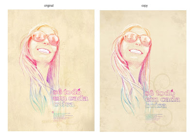
I decided to do a master copy by Portuguese Illustrator, Mario Belem. I really liked how loose and colorful this particular portrait of his is, and I like that he incorporated text that played on the same colors as his drawing. I think I can probably learn a lot more from this artist in the future as his collection is extremely diverse.

Here is my copy:


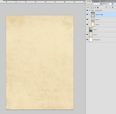
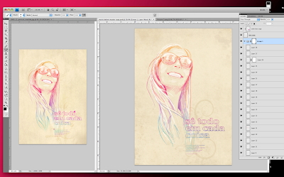
1) I started out with the background. First, a layer of flat color on bottom and then a random texture I found online that I duplicated and rotated. I applied a linear burn and decreased the opacity to both texture layers.


2) I noticed he had a few subtle, swirly designs in the background as well, so I found this retro, swirl image online and isolated the part I wanted to use (the orange).


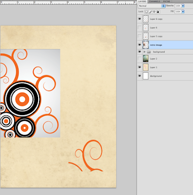
3) I changed the color to brown, chose "Darken" from the effects drop-down menu, and lowered the opacity. I then duplicated, rotated, and transformed to fit the original the best I could.


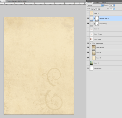
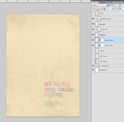
4) For the next part, I switched to Illustrator. I didn't know the exact typeface he used so I found one that looked close enough after transforming it a little bit. I made a box of color and applied a gradient mesh (Mr. Babcock's video helped a lot) filled with the colors I sampled from the original.


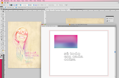
5) I copied both the text and the box 'as pixels' back into Photoshop, placed the box directly on top of the text, and applied a clipping mask. I repeated steps 4&5 for the paragraph of smaller text below.
*Looking back, I probably should have first applied a brush stroke to the text in illustrator to give it that "handwritten feel".


6) Next, I drew the woman in a series of layers, starting with white. I applied really loose, long brush strokes and found it necessary to draw with my entire arm instead of just my hand, otherwise the lines didn't come out straight.
I didn't take a screenshot for each color because that would be ridiculous, but I will say there were 30-something layers, many with different opacities, some with layer masks, etc.


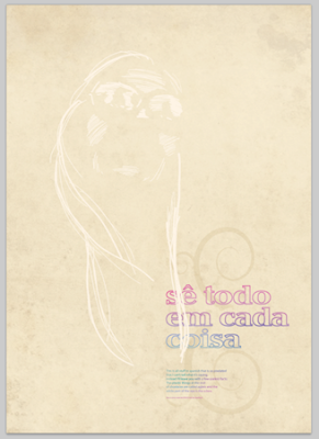
7) When I finished drawing, I grouped all the layers that made up the portrait together and masked out the parts that spilled over the text.
Oh, and then I drew the little, pink bird (not pictured here).


Overall, I had a lot of fun with this study. Lots of trial and error. I'm still semi-new to the wacom tablet so as you can imagine, while drawing the portrait, ctrl+z became my best friend.

Question:
Is there an easier method to apply a gradient to an entire phrase or paragraph of text instead of the clipping mask method I used? When I tried in Illustrator at first, even after creating outlines, the gradient would apply to each letter separately instead of gradually across the whole group. And that's no good.


Any other criticisms?

back

Hi again. So, I have been absent for a good five days or so. The reason is: my brother is leaving for the Army in less than a month so my Mom planned a small, family trip so that we could all do something together one last time before he goes to basic. I thought that I was going to have Internet access at the place we stayed, so I brought my computer to at least try and get some research done, but the connection was down for the week. Needless to say, I have a lot of catching up to do.

Anyway, I just thought I should make a post explaining that no, I'm not dead, and yes, I'm going to be working really hard the next couple of days to get caught back up :)

Thanks,
Jess


edit:
Oh, P.S.! If anyone is ever in need of any cloud/sand/seashell/water/bubble textures, I was able to take a few pictures this weekend. My camera isn't the greatest ever but just as a background or as effect layer textures, they might be kind of helpful in the future. (most are at 180ppi/ 10x14in.)


Tuesday, May 11, 2010

post numero uno


Hello all. I'm really excited to be taking this course. I feel like I'm going to learn a lot from such a diverse group of talented classmates. There are a couple of directions I want to go in personally this summer -- I feel like vector art is where I'm lacking the most, but I'd also really like to improve on pieces that include both vector elements from Illustrator and tex
tural, raster-based images from Photoshop. I mean, yeah, anyone can slap a smart object into a Photoshop doc., or vice versa, but doing it effectively so as to create a great piece of work is where I'd like to improve. I'd also like to improve in the way of typographical elements. Since my major is Graphic Design, I feel like I definitely need to spend some time in that area this summer.

Having said that, I'll no
w dump a few images from some illustrators and designers I really like. They all possess different skills and elements I'd really like to learn from this semester.


Olaf Hajek
:

(I actually recently added this guy on facebook and we had a nice chat - really cool guy).
I really like the use of texture and color in all of his pieces.
For a closer look, go
here.


Mario Hugo:
This guy does a lot with letters and words. I feel like I could learn a lot typographically from him. He also does some really great vector/line work. I also just like the overall, general vibe I get from him. A lot of his work is pretty dark and that's the direction I sometimes tend to lean toward.
For a closer look, go here.


Oliver Weiss:
Weiss is probably the most diverse of the three. He does anything from spot illustrations to comics to photoshop collages, you name it. I really like some of the vector work he does, and then he's able to incorporate halftone dots among other textures without letting his work get too cheesy or cliche.
For a closer look, go here.