Since his piece uses specific photos that I didn't have access to, I just had to do the best with what I could find.


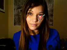
First, here are the images that I used. Found them in a google search:


Here's his original:

Here's mine:


Kind of a long step.
I extracted the hoodie, the cat's head, and the headphones from their originals, placed them together, then desaturated everything. I did 8-layer cutout filters to all of them but faded the headphones to 80%. I used the brush tool to change the back of the jacket and cat's head to black. I drew the glasses in Illustrator and brought them over. Then I selected the section on the headphones that I wanted to color red, filled it with flat color using the paint bucket, then changed the mode to Overlay. Last, I drew the cord with the brush tool.

I opened a flattened .jpg of my work so far in a separate window, selected the area I wanted, and filled with the paint bucket. I then copied it over to my .psd, enlarged it, and placed it behind the cat.

Next, I just added and fixed certain details: added a layer of flat, yellow to the top of the cat and changed it to Soft Light mode, drew the whiskers and additional fur onto the face, dissolved some of the black on the jacket, added the border, touched up the glasses and surrounding, yellow line, etc.

Last, I drew the coffee logo in Illustrator and transferred it over.

Pretty pleased with the way it turned out. I guess I didn't realize this when I was doing it, but there seems to be a little bit of texture on top of the orange background/logo in his piece, so I might go back and add that.
Nicely done! I like how you aren't doing exactly what you are seeing, you are kind of putting your own spin on it. Great job!
ReplyDeleteI think that is probably better that you had to source your own photos. Besides the "papery" texture on the image there is some darkening around the edges too. I hope that you did all of this in a higher resolution. Adding textures is a lot easier when you have more pixels to work with.
ReplyDelete