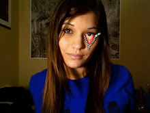
This is my original based on the Mario Belem master study.

I felt like long, straight hair was kind of safe, so I decided to try and draw my friend, Keely's, curly hair. The background is mostly hand-done and the text is kind of an inside joke but I made sure to incorporate the gradient like in the original. Drawing in grayscale and then adding the color gradients later (thank you, Mr. Babcock, for that video) helped tremendously vs. drawing all the lines in their specific colors like I did in the copy.
I really like the detail of the hair. It looks like a labor of love. I also noticed (not sure if it was intentional) how my eye catches on blackish part of the hair, led to the orange, then to the red of the hair and then to the logo, and finally back up to the glasses...I like that. Very simple, but thought out.
ReplyDeleteOne of my main concerns with the piece is if you slightly blur your eyes, or step back from the screen the skin is not reading at all. Based on your master-study there was a more enunciated levels of value(mostly assisted by the white in the hair and face, which pushed the head forward). I think that your background is competing for attention. Maybe lighten the opacity? And/or maybe add some actual white to the hair, and more to the face?
I noticed on my piece too a lot of competition with the background as background and the figure area foreground. The solution is probably to address the background with some sort of accessory line-work/texture. Without it we are basically making an invisible person where you can see right through them. But I guess that is part of the style.
ReplyDeleteGood work Jessica!
Thank you guys for the detailed responses. Mike, I agree with you completely. I knew there was something a little off but I couldn't put a finger on it. I know this particular style called for some of the background to show through the skin and hair, but I definitely am going to go back through and add a few layers of white to make it pop a little more, it needs it. And then maybe some more subtle work on the background. Thanks!
ReplyDelete